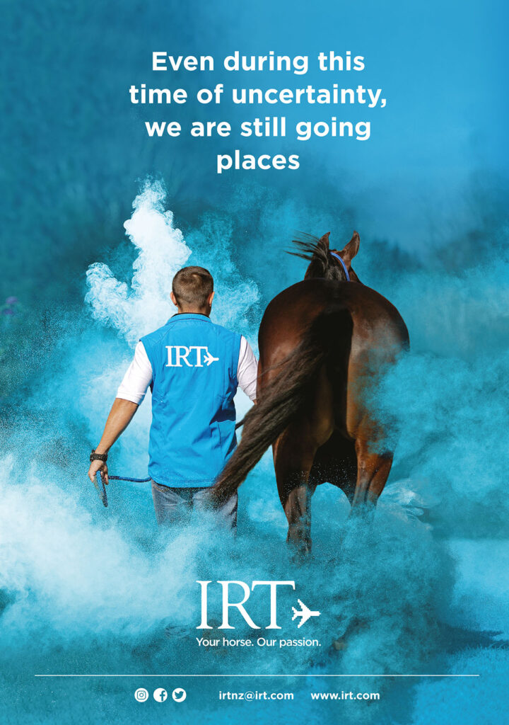
It is sometimes easy to overlook the tired corporate photos that have been overused/overloved. But infusing just a bit of drama into the photo can change the complete meaning and give you a great new look to work with.
In the photo below, all it took was a bit of powdered dust, made blue to match the brand colour of course. Extra depth, punch, and a bit more of a story unfolding.
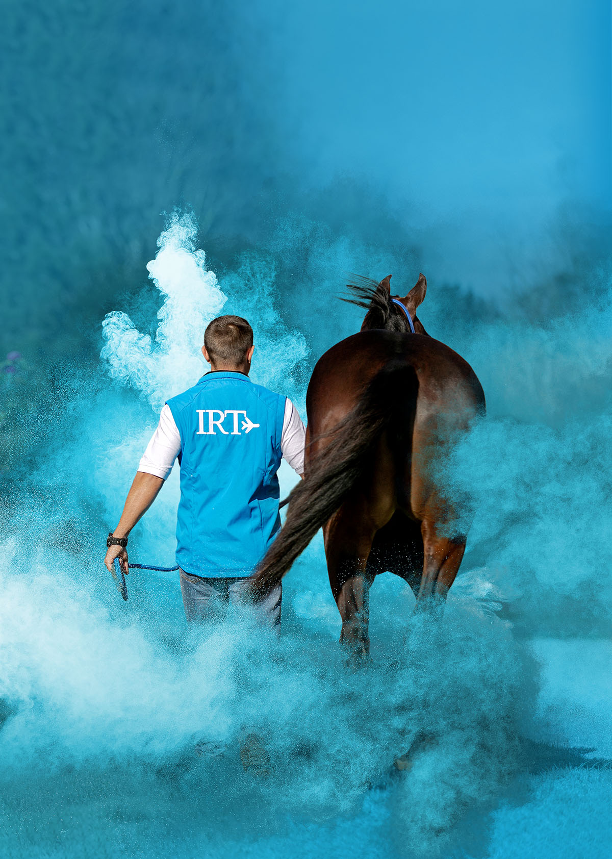
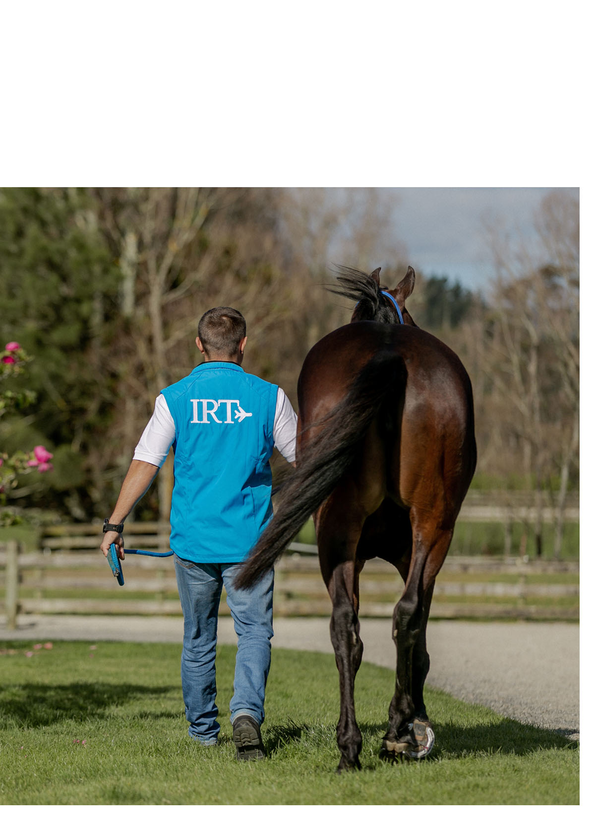
The finished advert, ready for publication. This was the rear cover, so the photo was aptly suited.