This months packaging challenge was to revamp the BrainBox range. A classic before and after deal.
The old packaging was dated. The product inside was still relevant and exciting, but no one knew what set to buy as they all looked the same.
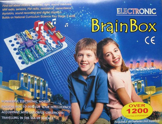 [old packaging]
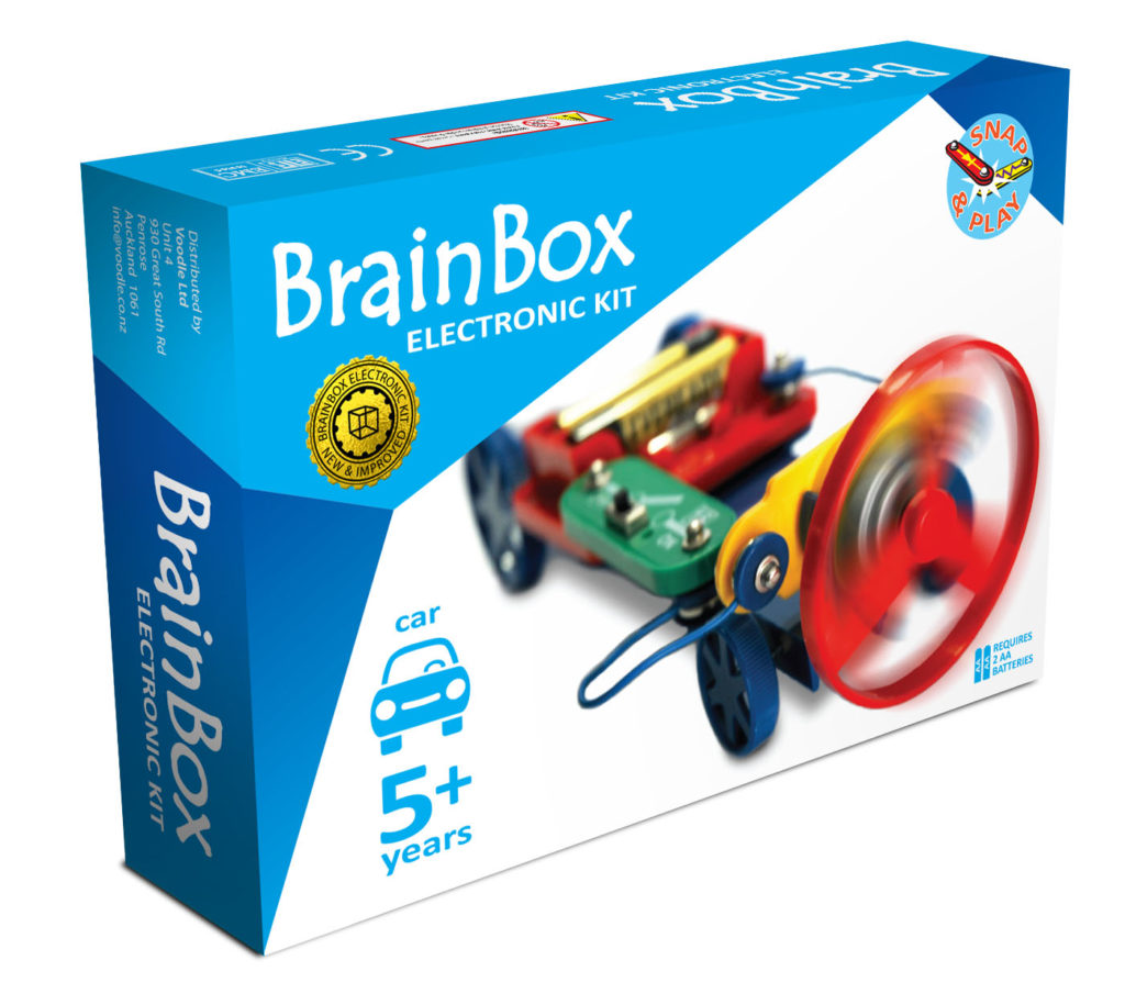
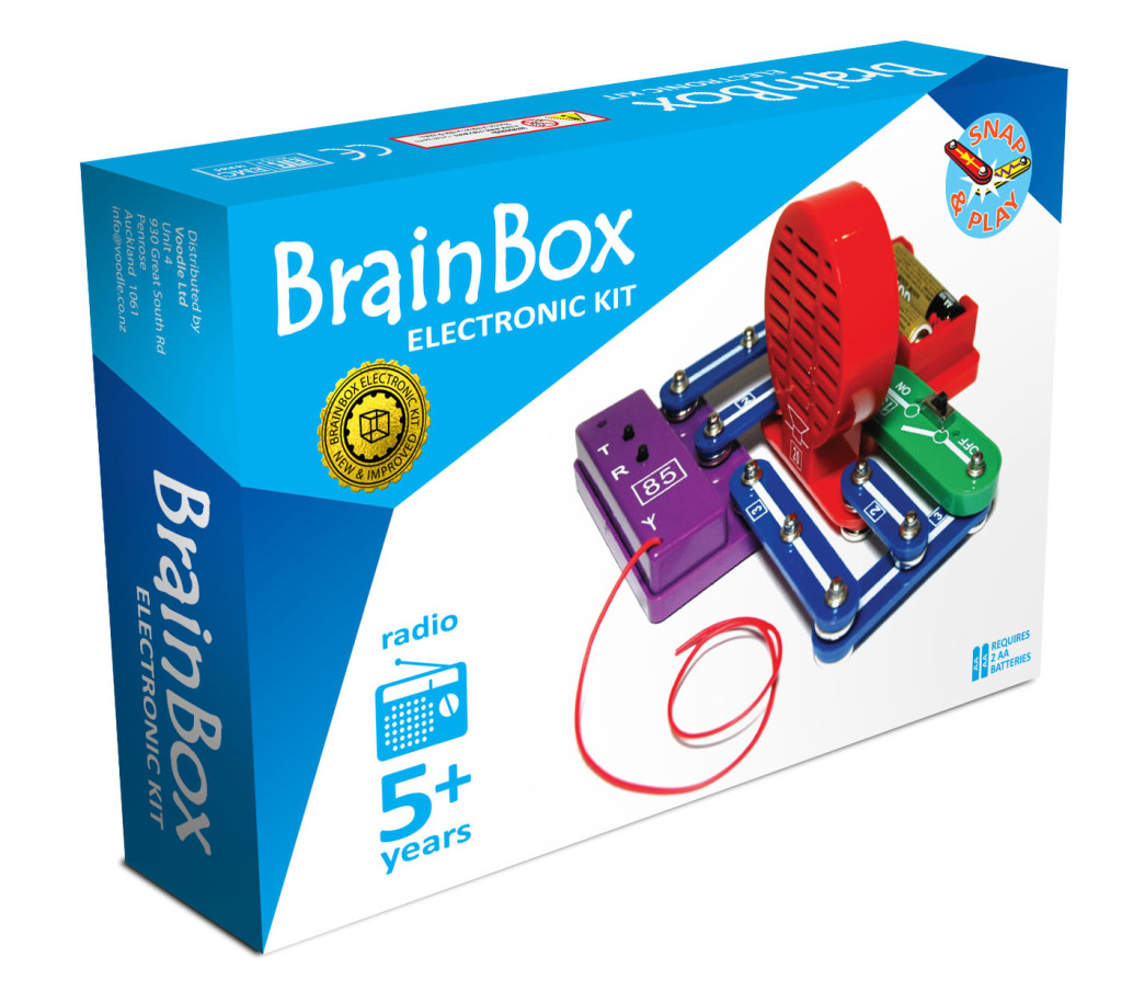
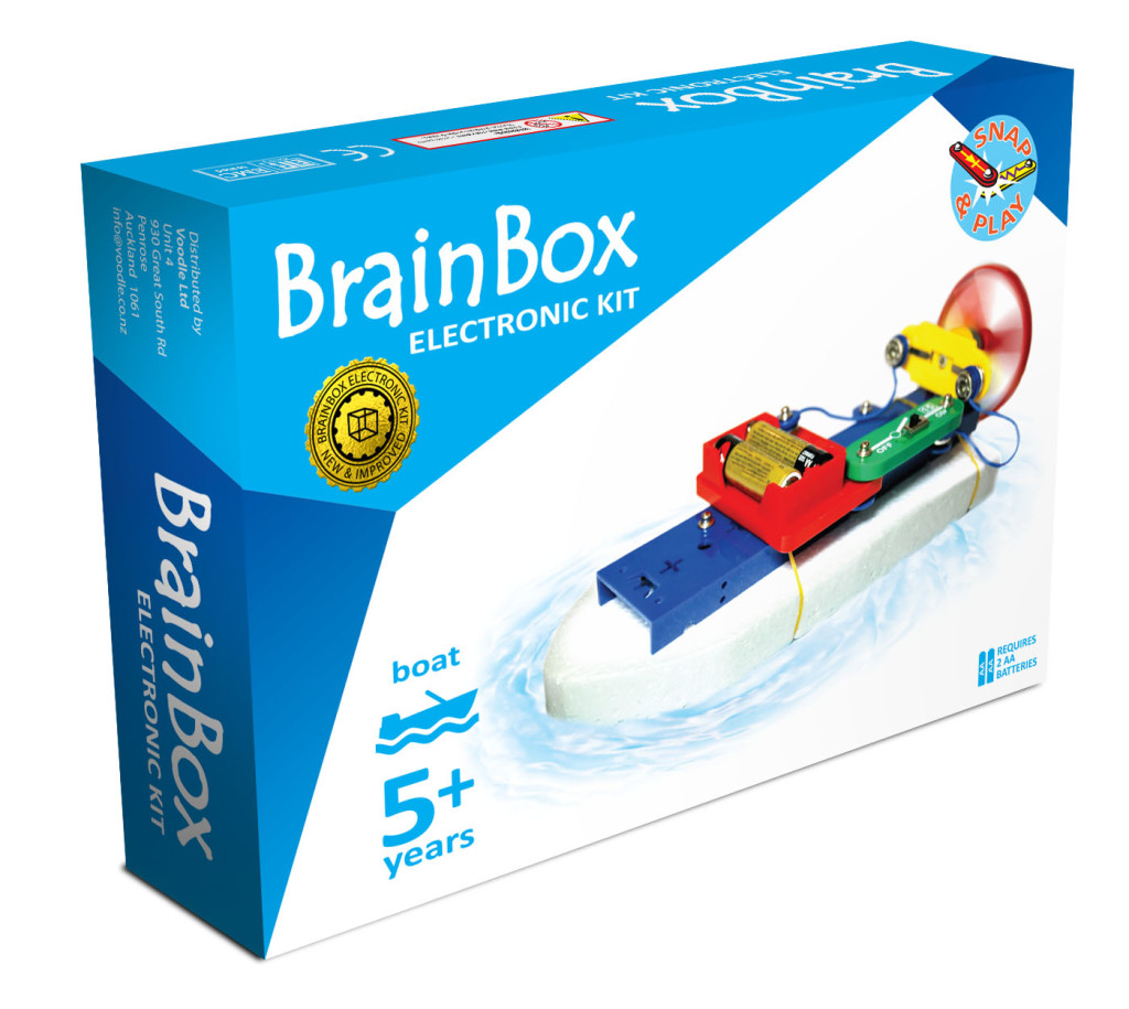
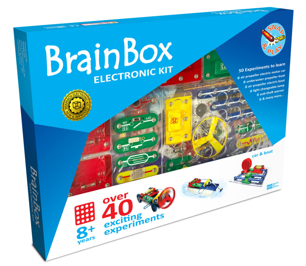
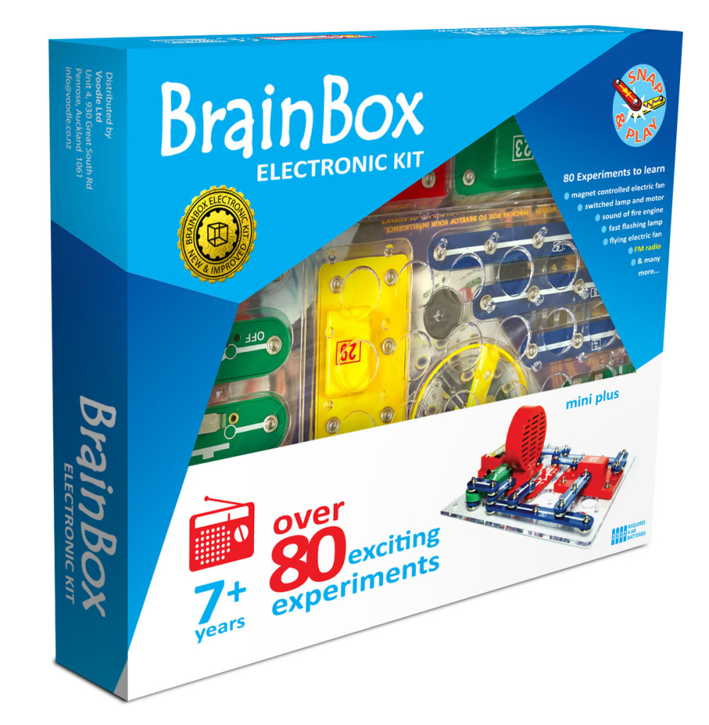
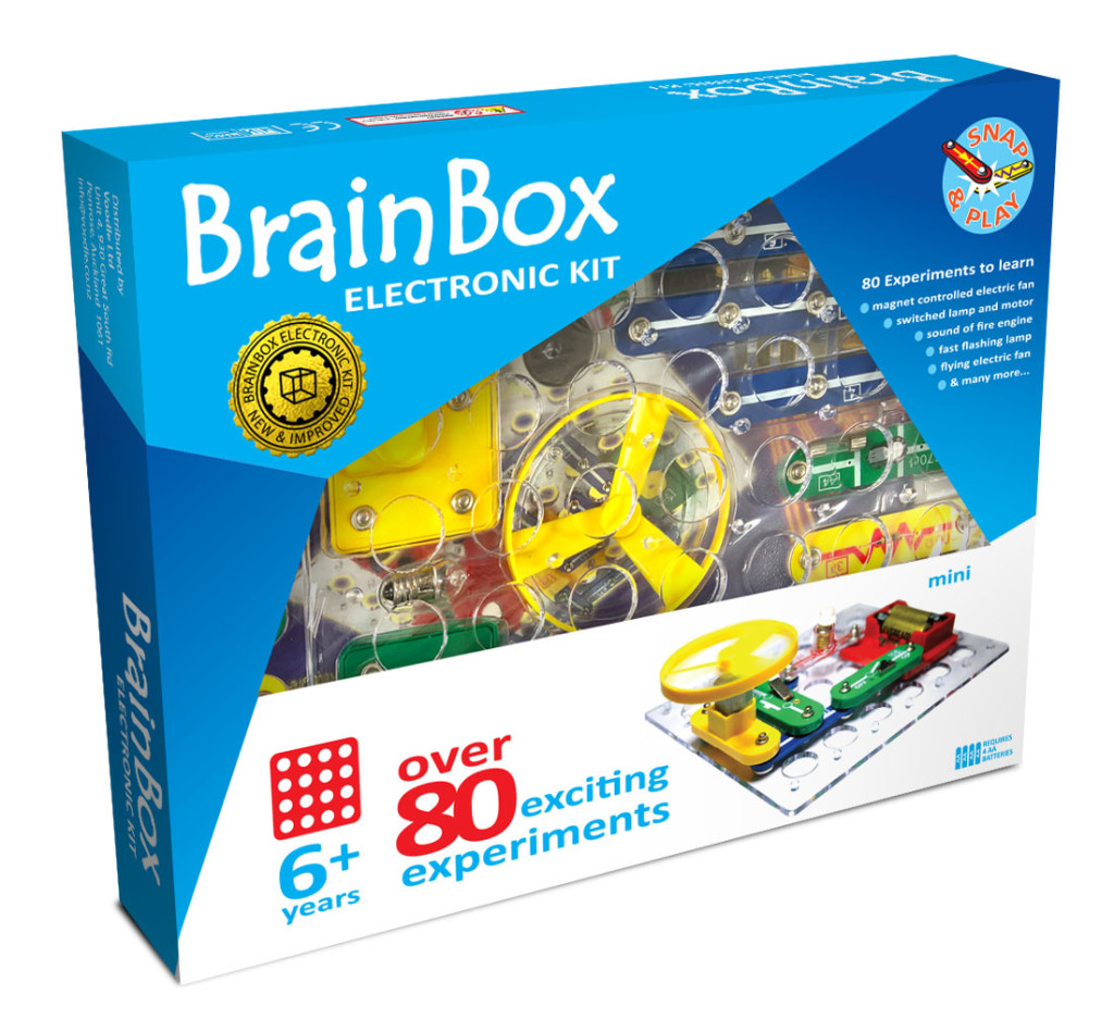
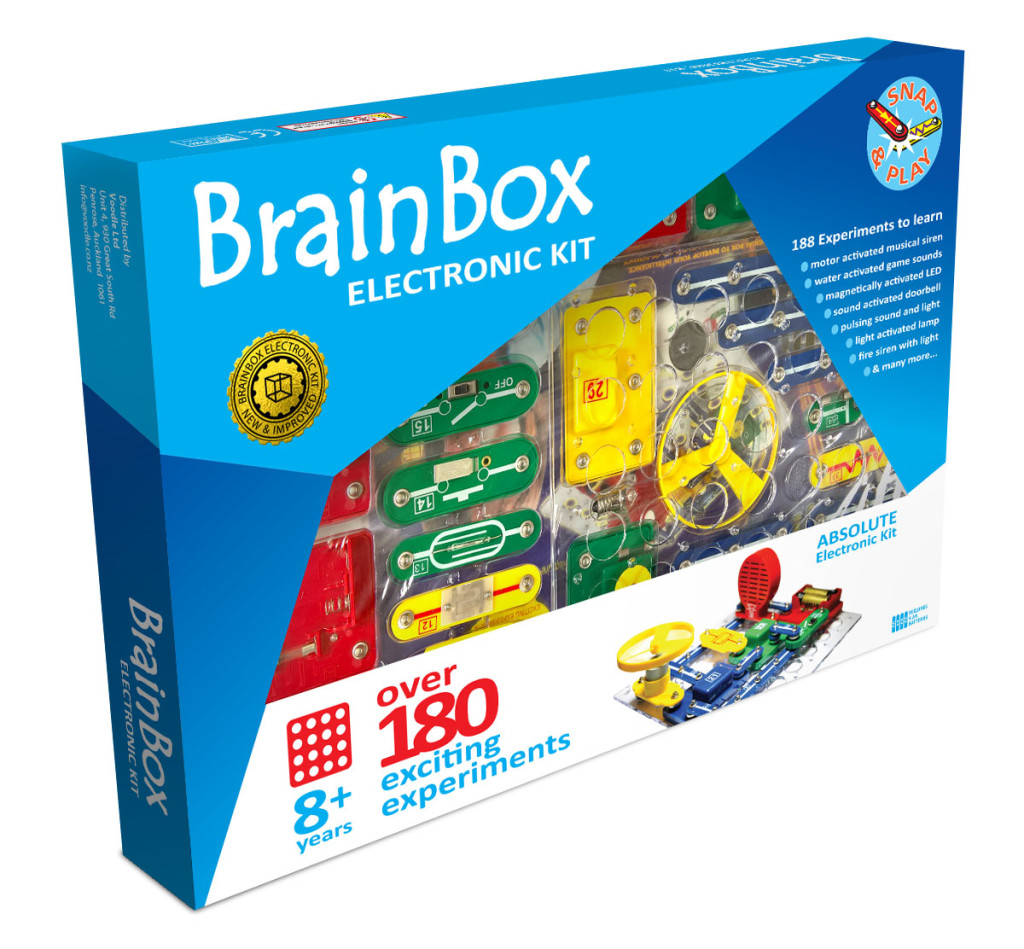
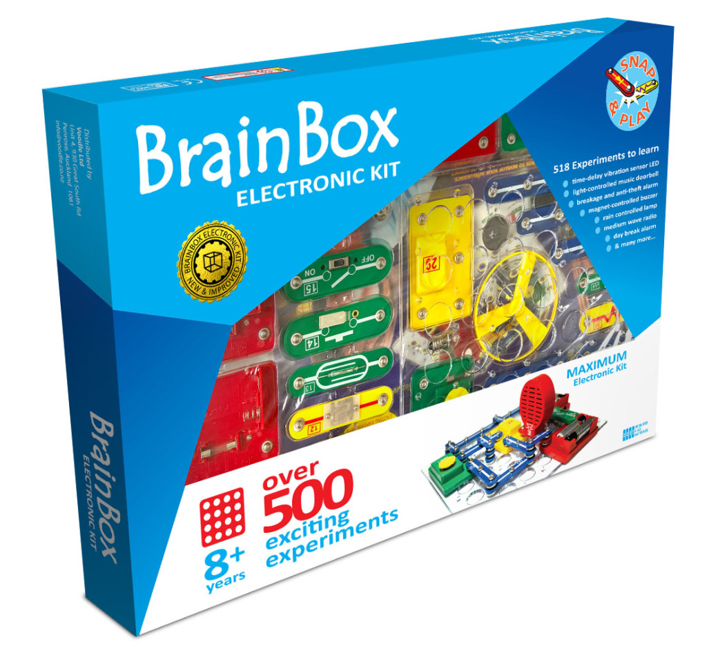
The top change was the inclusion of a window – the product looked fantastic inside and if you want someone to buy it, show them the real thing (we have all been burnt by basing our purchase on the pretty picture, but find trash in the box). Next a little make over; keep the blue and the basic logo, but clean it up a bit with flat, clean solid colour. Customers were not sure what box to buy so we added a clear age range and each box had a simple product title for what was in the box.
My favourite part was the photo shoot – I got to assemble every box into different projects. It’s a tough job people, but someone has to play with the toys. Loved how the shots came out – vibrant and a strong presence.
Don’t forget if your product needs something extra, like batteries to work, put it on the front so we all know. Children aren’t going to love you if they can’t play with it straight away. Our product testing showed us the customer also wanted a simple list of what different things could be built with kit and to show how simple it was to put together.
And the “new & improved” gold foil stamp – well, we all need a little bling to stand out from the old crowd sometimes.