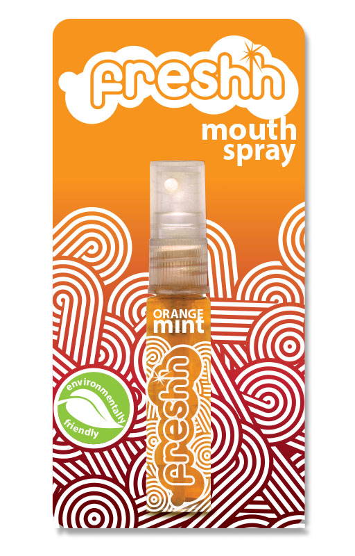
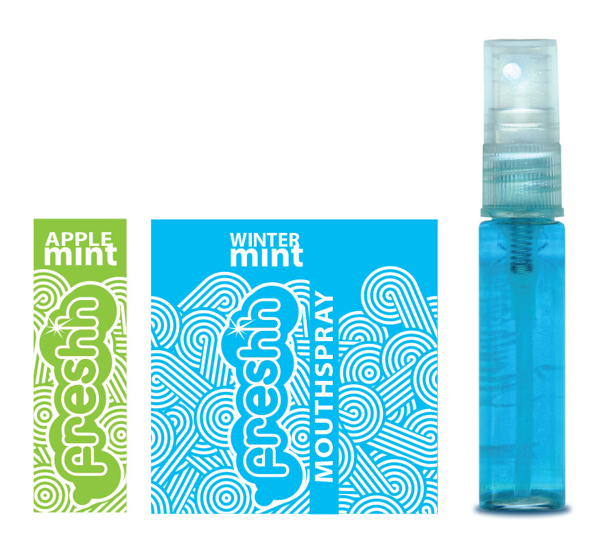
This is a dead project – an idea for a product that the client never went ahead with. It only made it to this first concept art. Packaging for a tiny product that had to capture attention at the counter, be friendly to the user and the environment, and it also had to be appreciated by both mature and a youth market.
As usual my favorite is the use of clean graphics to get the message across. I created a simple repetitive wallpaper to represent the spray, and fresh air, fresh water, freedom.
Using plain white printing on the bottles allowed for the colour of the liquid to champion the design. Leaving all the information for the backing card meant I could indulge in a very clean design.