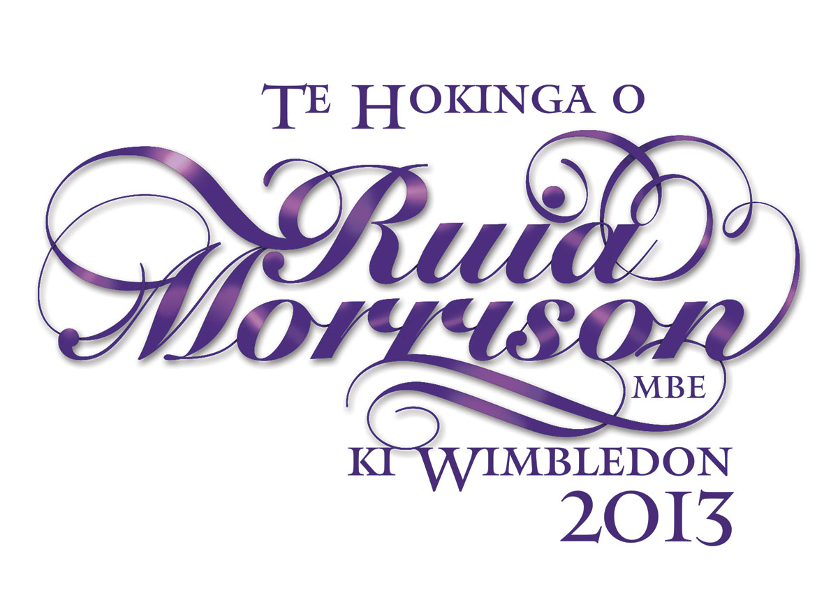
Typography is probably my favourite part of graphic design. I’ve loved it since I was a kid creating headings for my school homework; often spending more time on the heading than the text of the assignment. This week we set up the cover page for an itinerary to Wimbledon for one of New Zealand’s most famous historic players, Ruia Morrison MBE.
The cover deserved something a little special, and the old flourishes made it into something very personal.
The final publication can be found here.
[light_box title=”table tennis 2014″ src=”https://virtualeyes.co.nz/wp-content/uploads/2013/06/Rui-Morrison-Wimbledon.jpg” type=”zoom”]  [/light_box]


