This is the story of how a logo was created…
The brief for the logo is rather short (sometimes a lot of research is achieved before we even enter into the picture), the client has a company name “Realty Story”, they will be selling real estate mainly to the Russian market entering Australia. It needs to be clean, simple and web ready.
Our initial dialogue was to check we were on the same page with; we need to strengthen the brand with the name, thinking about “…and they lived happily ever after” theme or “start a fresh story”. look at associating using your company to get more than a house – to get the life/story they deserve. A home page is a book that opens into a popup book with a house you can click on (simple white 3D, making use of shading). Use of calligraphy to show off name and feel (big flourishes, real ink feel). Fairy tale castle with towers.
Next are a small selection of diverse logo sketches to get a feedback from our client. with four pages showing basic concepts/directions, they are only basic ideas at this stage, not finished or properly coloured.
A: simple clean style based on a book style with the first letter ornamental
B: using books to create a house, will need shading and detail
C: calligraphy style, lines might be too fine to look good on anything larger than a webpage
D: basic pop-up book. can go cartoon style or really fancy using real shaded 3D paper look
We love typefaces, and every logo starts with finding the right typeface to match the feel.
[one_third]
[light_box title=”RealtyStory initial A” src=”https://virtualeyes.co.nz/wp-content/uploads/2013/01/RealtyStory-initialA.png” type=”zoom”] 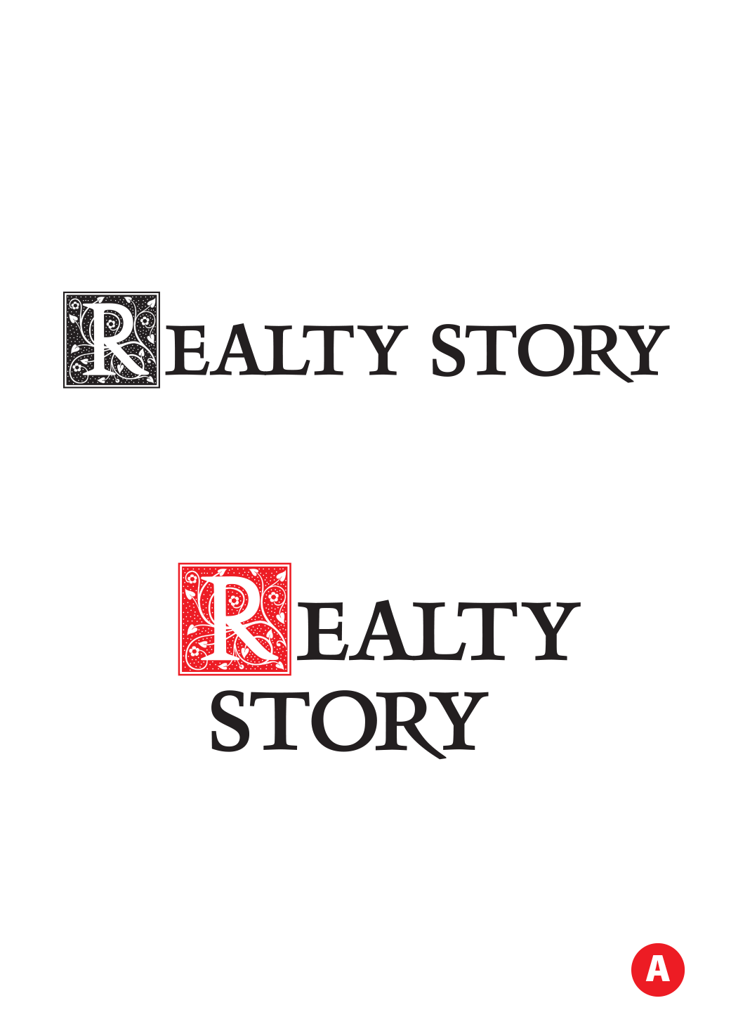 [/light_box]
[light_box title=”RealtyStory initial B” src=”https://virtualeyes.co.nz/wp-content/uploads/2013/01/RealtyStory-initialB.png” type=”zoom”] 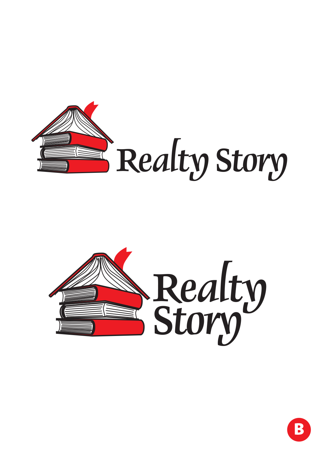 [/light_box]
[/one_third]
[one_third]
[light_box title=”RealtyStory initial C” src=”https://virtualeyes.co.nz/wp-content/uploads/2013/01/RealtyStory-initialC.png” type=”zoom”] 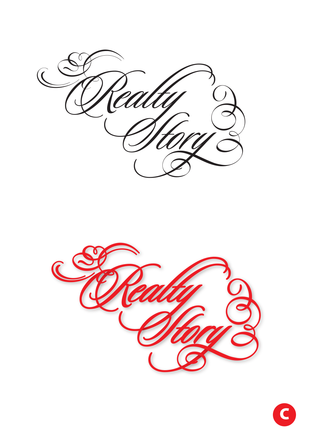 [/light_box]
[light_box title=”RealtyStory initial D” src=”https://virtualeyes.co.nz/wp-content/uploads/2013/01/RealtyStory-initialD.png” type=”zoom”] 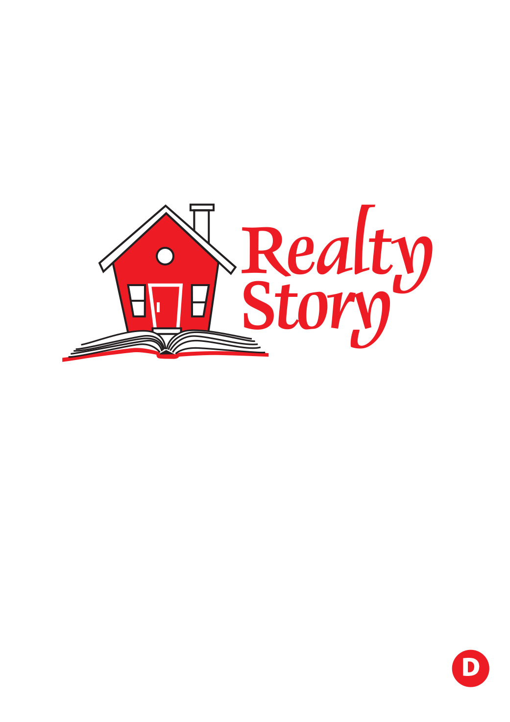 [/light_box]
[/one_third]
We hone down this selection and add colour and texture. We looked into colours and found the Russian colours lately have been a strong red with white stripes/decorations (especially during the Olympics). We preferred the simplified book illustration/logo – cleaner, modern and easier to interrupt both large and very small. Also added some collateral, a simple by-line.
[one_third]
[light_box title=”RealtyStory initial E” src=”https://virtualeyes.co.nz/wp-content/uploads/2013/01/RealtyStory-initialE.png” type=”zoom”] 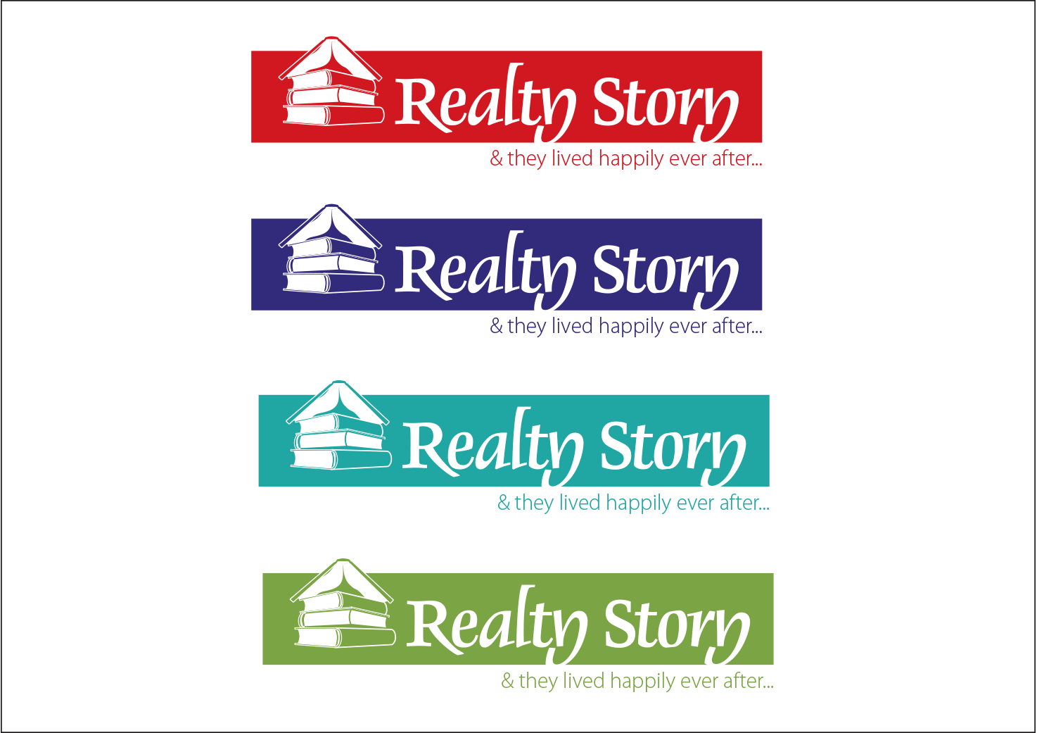 [/light_box]
[light_box title=”RealtyStory initial F” src=”https://virtualeyes.co.nz/wp-content/uploads/2013/01/RealtyStory-initialF.png” type=”zoom”] 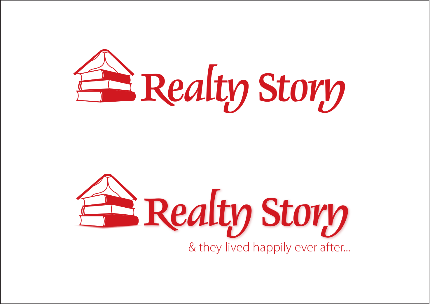 [/light_box]
[/one_third]
[one_third]
[light_box title=”RealtyStory initial G” src=”https://virtualeyes.co.nz/wp-content/uploads/2013/01/RealtyStory-initialG.png” type=”zoom”] 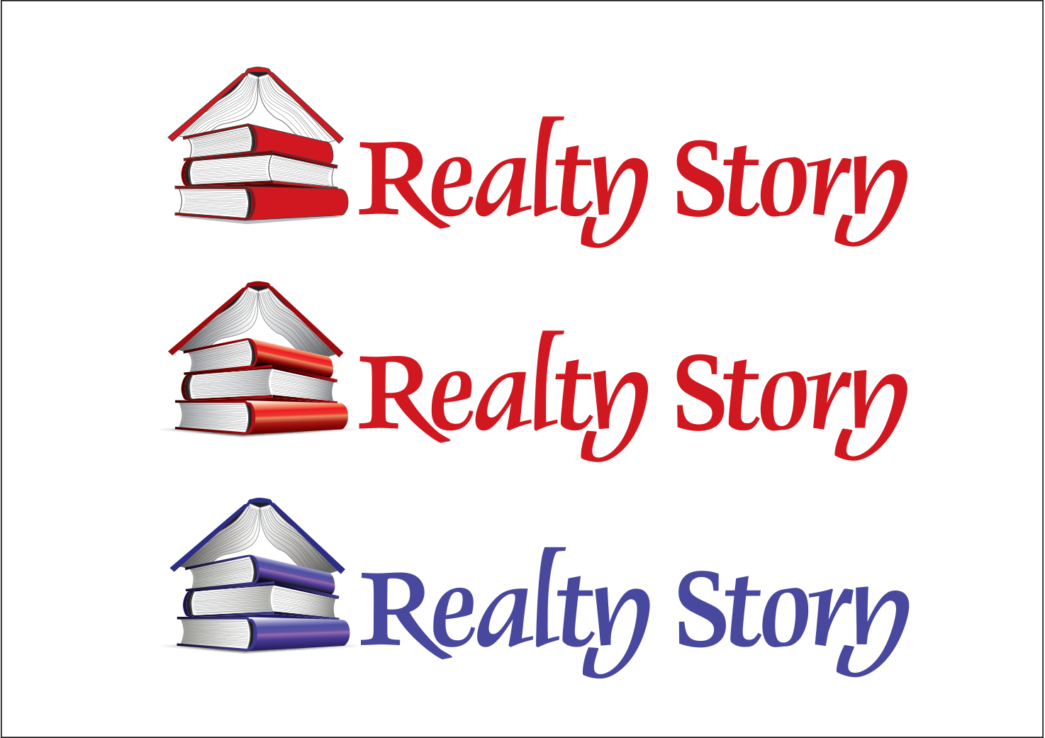 [/light_box]
[/one_third]
The final product at the top of the page.
The project took approximately two weeks.


